Columns enable versatile layouts that allow you to combine multiple types of content within one section. Consider these examples of columns in practice:
Dribble uses two columns, each displaying two images.
Trello’s latest update features side-by-side content with one image and one text block.
Etsy combines images and text across three columns.
Vudu utilizes four columns to highlight movies that even Netflix might pass on.
Adding columns to your message
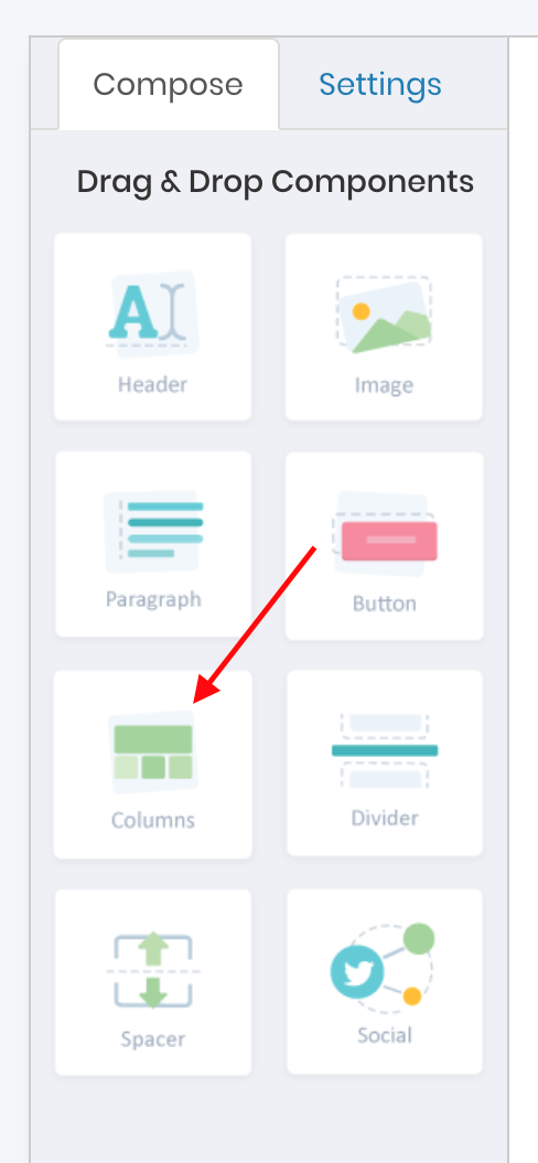
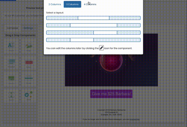
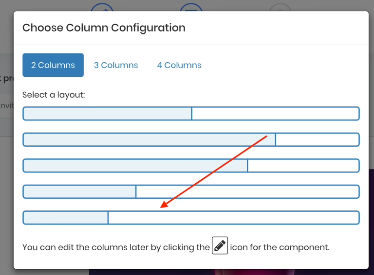
When you drag the columns component onto the canvas, a popup appears allowing you to select both the number of columns and the space each column will occupy within the row.
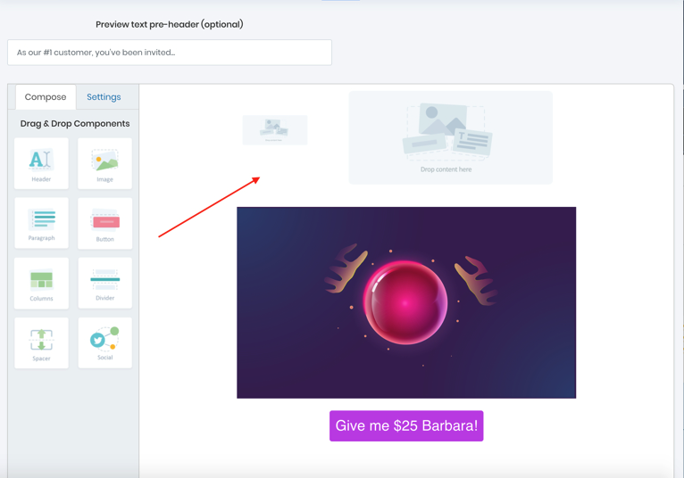
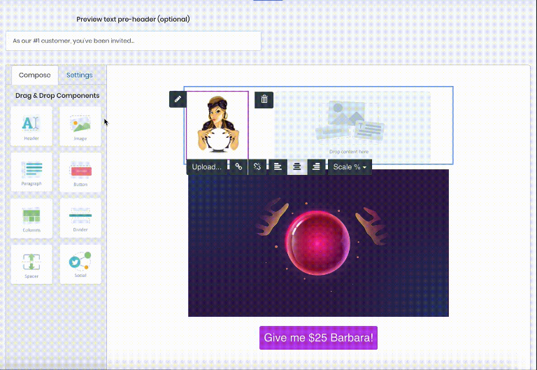
For instance, choosing a two-column layout will create two placeholders on the canvas
Where you can drop components such as images, text, or buttons.
The overall row that houses your column layout is called a section, indicated by a blue highlight,
While each individual column is marked with a purple highlight.
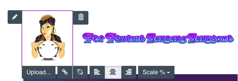
Clicking within a purple area displays the component’s toolbar (for example, the toolbar for an image), and clicking within a blue area produces the section toolbar.
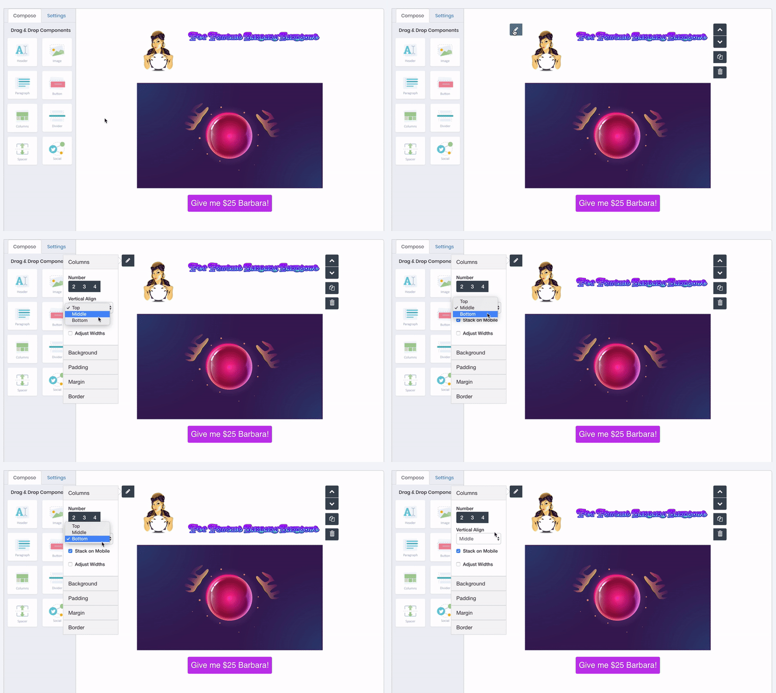
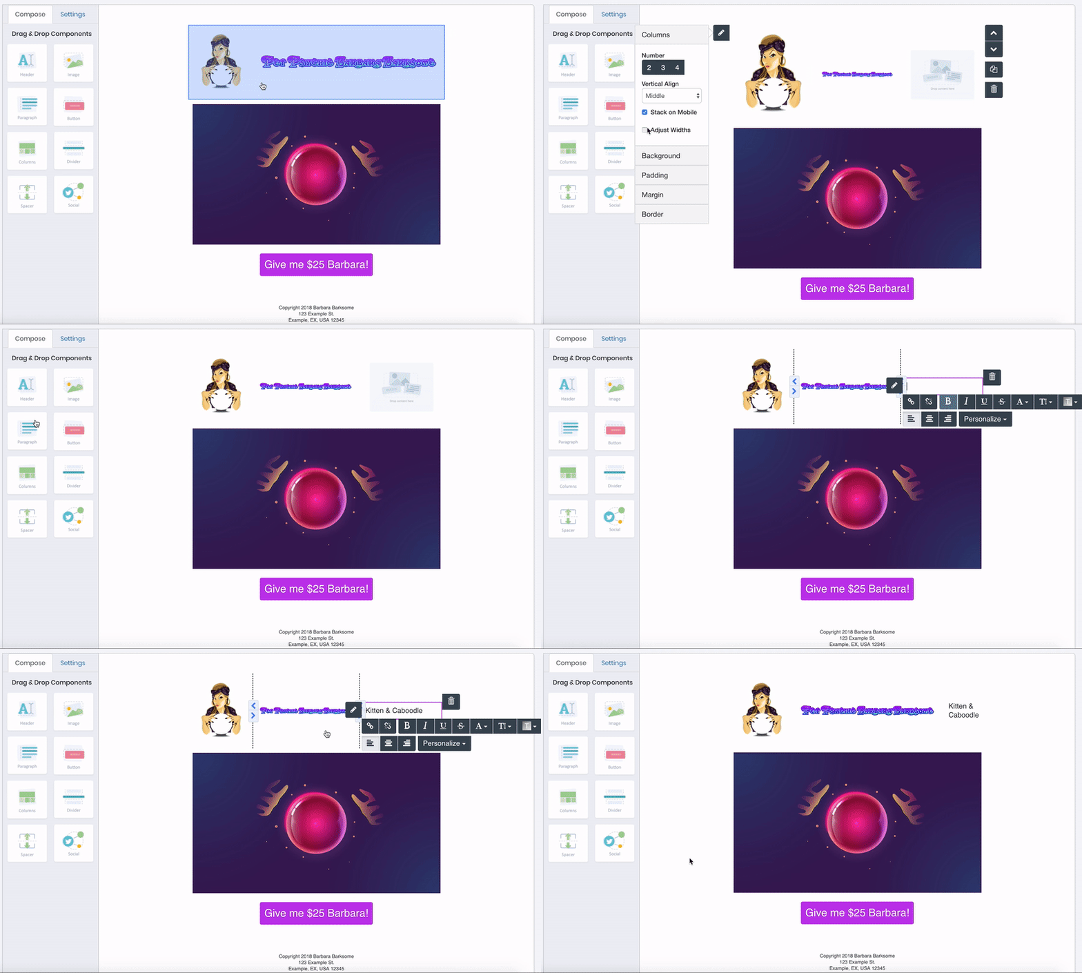
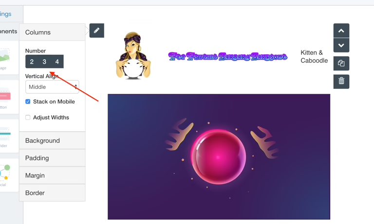
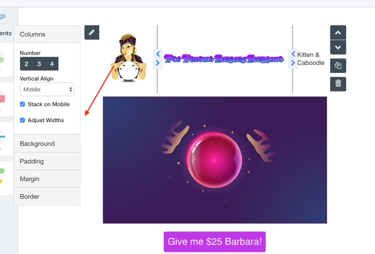
Using the section toolbar, accessed via the section edit pencil, you can adjust several settings:
Set vertical alignment for content (top, middle, or bottom of each column).
Change the number of columns in a section.
Modify column proportions by adjusting widths.
Add additional content to your layout.


